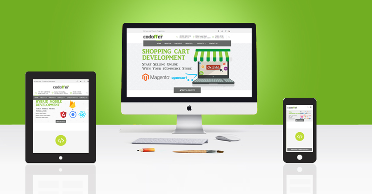
Previously, people used to browse the web only on their PC's or Laptop's. With rapid advancement in technology and communication, today internet has gone handy with people on move. People surfs and checks their venue for different purpose and in form of entertainment on the way by means of Tablet's and Mobiles. Today your website doesn't just browsed from desktop anymore. To create a website version for each resolution and new device is neither practical nor possible. Instead of developing and managing multiple website versions, business with responsive site takes an approach of content management, as it enables to manage only one site, for all type of gadget.
Responsive website designing (RWD) is the approach that responds to the user's environment based on screen size, platform and orientation. RWD crafts the sites by means of flexible grids and layouts, flexible images and intelligent use of CSS media queries. The server side components (RESS) along with media queries supports faster loading and richer functionality service in all form of devices. The RWD website resolves and switches automatically according to the gadget. In short it responds to the user's preference.
RWD must be aimed with providing best viewing experience, easy reading and navigation with minimum resizing, panning and scrolling through out the range of gadget from mobile to desktop. Responsiveness creates a multiple platform for your site making it portable, reliable and economical. Whether your target audience uses Android phones or iPad tablets, RWD lead you to a majority of your audience without nerve-racking your website's look on different platforms. In other words RWD prevents the consequences of losing patrons from one device to another.
On the other hand, search engines like Google, also rank RWD website higher, enabling the patron, who is searching for his requirement, to search from any device. This keeps the search engine more users friendly and has given importance to SEO friendly responsive website to keep your business handy.
Responsive Web design is a new way of philosophy concerning design.
At Codoffer we realize the fragile balance between the RWD design and platform from where it is used. We maintain equilibrium between two, giving you best visual experience and technically perfect website. Our team helps to design and optimize your RWD thereby holding and gaining maximum visitors irrespective of various devices, browser and platforms being used.
At Codoffer we combine our extensive knowledge of webbed world and mobile platforms for relevant and successful solutions on both ends.
For further detail contact us info@codoffer.com